Intro to Image Production
On this class page, you will find work completed in Image Production class. Projects will be uploaded here as I complete more work.

This project, called "collage" includes five photos of myself, five unedited photos from the internet, five photos with the background removed, five clipart images and five of the same clipart images with the colors altered. I chose my images based on all of the things that make me, me. For example, the seashells, beach ball and sunset depict my love for the beach.

This project, called "Magazine Cover" represents exactly it's title. Replicating a magazine cover that you can find in any local library or grocery store, this piece contains a close up of shot of a leaf, a shadow on a sidewalk, an action shot featuring fire, scenery from nature, and, finally, me, the photographer of it all.


These projects, called "Full Logo" and "Abbreviated Logo," act as a watermark. It will be on the rest of my projects from now on in order to prove that they are my work and prevent copyright. I chose to make this design as my logo because of the fun and unique style it offers, representing my overall creative vibe.

This project, called "Panoramic Same Spot, Same View," is the result of standing outside in the same spot and taking 5 pictures, rotating my body a little bit more after each one. I made sure that where one photo ended, the next one begun. Maintaining consistent exposure, focus, positioning, and perspective across all 5 images helped me to achieve a seamless blend.


For this project, called "Medium Close up," I applied all of the same skills and techniques I learned for panorama's during the last two projects. For this one, I used my families medium sized, knee-high Santa Clause statue to take my close-up photos. It was perfect timing for this project as well, because I had the statue out right near me as a decoration for Christmas!
This project, called "Panoramic Different Spot, Same View," is the final result of standing in the commons and taking 5 pictures, moving slightly after each one so that where one picture ended the next one begun. Maintaining consistent exposure, focus, positioning, and perspective across all 5 images helped me to achieve a seamless blend.

For this project, called "Small Close up," I applied the same skills that I used in the panorama "Medium Close Up." The key difference between this project and the "Medium Close Up" is mainly the contrasting size of the objects that are photographed. By maintaining consistent exposure, focus, positioning and perspective throughout the images in this project, I was able to create a seamless blend.

This project, called "Holiday Cards," has a front cover, a back cover, an upside- down inside cover and an upside-down message. Each of these sections include images and festive scenes that are often displayed in Christmas cards. I chose to make a Christmas card because Christmas is one of my favorite holidays, and I made sure to include a photo of hot chocolate and a fireplace because my family always drinks hot chocolate by our fireplace on Christmas day.

For this project, called "Mirror - Face," I began by taking a regular photo of Ozlem's face on the provided camera. Then, I used the "marquee" tool in Adobe Photoshop in order to select one side of the face up to the exact middle. After that, I copy and pasted the selected part and used the "edit," "transform" and "flip horizontally" tools to create a mirror effect. Finally, I blended the middle and erased any extra lines that were left on Ozlem's face, making the project appear to be one seamless image.

For this project, called "Mirror - Body," I began by taking a photo of Mr. Grillo from his feet up on the provided camera. Then, I used the "marquee" tool in Adobe Photoshop in order to select one side of his body up to the exact middle. After that, I copy and pasted the selected part and used the "edit," "transform" and "flip horizontally" tools to create a mirror effect. Finally, I blended the middle and erased any extra lines that were left on Mr. Grillo's body, making the project appear to be one seamless image. The skelotons on each side of him give the image an eerie effect.

For this project, called "Mirror - Artistic," I began by taking a photo of one of the art walls in our school on the provided camera. Then, I used the "marquee" tool in Adobe Photoshop in order to select one side of the wall up to the exact middle. After that, I copy and pasted the selected part and used the "edit," "transform" and "flip horizontally" tools to create a mirror effect. Finally, I blended the middle and erased any extra lines that were left on the art display, making the project appear to be one seamless image.

For this project, called "Mirror - Scenery," I began by taking a photo outside of a lake on the provided camera. Then, I used the "marquee" tool in Adobe Photoshop in order to select one side of the image up to the exact middle. After that, I copy and pasted the selected part and used the "edit," "transform" and "flip horizontally" tools to create a mirror effect. Finally, I blended the middle and erased any extra lines that were left on the lake, making the project appear to be one seamless image.

For this project, called "Mirror - Choice," I began by taking a photo of a Starbucks cup on the provided camera. Then, I used the "marquee" tool in Adobe Photoshop in order to select one side of the image up to the exact middle. After that, I copy and pasted the selected part and used the "edit," "transform" and "flip horizontally" tools to create a mirror effect. Finally, I blended the middle and erased any extra lines that were left on drink, making the project appear to be one seamless image.

For this project, called "Virtual Collage," I went on a scavenger hunt to take and find a total of 20 pictures of specific items listed in the instructions. For example, I used a picture of me as a baby for an image beginning with the letter B, and I used a picture of my iris for the "perfect circle" option. I took some of the 20 images around my house at the time that we were virtual, while I found a few other photos online. I chose to use all of the pictures included in my collage because they all mean something to me: whether that be the beach, my favorite vacation spot, or even a couple childhood photos.

This project, called "A-Z Grid," was made to show off all my "letter" projects that were completed while we were virtual. The template for this collage was posted by Mr. Grillo, so all I needed to do was add one letter project to each of the slots provided and adjust the sizes to make the projects fit.

I chose this photo for "Tonal Contrast 1" because I was super happy with how this photo of Lauren Spencer Smith (one of my favorite singers) came out. I took this picture at her concert and had been wanting to show it off, and this project was a super fun way to do it. Being that this photo is a silhouette, it is an excellent example of tonal contrast.

I chose this photo for "Tonal Contrast 2" because I have always loved palm trees and how aesthetic they looked. I thought this close up was super pretty, and this picture is special to me because it was taken right outside of my Grandparents house in Florida. Being that this photo is a silhouette of the palm tree, it is a good example of tonal contrast.

I chose this photo for "Tonal Contrast 3" because it was taken at one of my favorite places in the world: the beach. This beach was located in Florida, where my parents took my sister and I for a family vacation. Here, I saw lots of beautiful animals that I could not help but photograph. Being that the photo of the bird is a silhouette, it shows nice tonal contrast.

I chose this photo for "Tonal Contrast 4" as it captures the end of a sunset in Florida. I have enjoyed watching and photographing sunsets for as long as I can remember, and this project allowed me to display a picture that I have been proud of for a while now. The palm trees help bring the image to life, and the fact that they are silhouettes mean that they show tonal contrast.

I chose this photo for "Color Contrast 1" as it captures a vibrant orange sunset over a blue ocean in Florida. The beach is my favorite place in the entire world, and watching the sunset while being there makes the experience even more enjoyable. This picture shows color contrast because orange and blue are opposites on the color wheel, and they make each other stand out.

I chose this photo for "Color Contrast 2" as it displays a bright red flower over a neon green leaf. I love flowers because they are beautiful to look at, fun to find, and have a pleasant smell. This picture shows color contrast because red and green are opposites on the color wheel, and they make each other pop out.

I chose this photo for "Color Contrast 3" as it displays a yellow flower necklace over a purple TV. I will always remember when my mom told me her favorite color combination was purple and yellow, so I wanted to include this in a photo. I love when things make me thing of my mom! This picture shows color contrast because yellow and purple are opposites on the color wheel, and they make each other stand out.

I chose this photo for "Color Contrast 4" as it displays purple flowers over a vibrant green bush. These flowers grow near my house every spring, but sadly, they only last for a week or two. So, whenever I get a chance, I like to photograph them. This picture shows color contrast because the purple flowers and the green bush contrast each other, making the photo "pop."

I chose this photo for "Conceptual Contrast 1" because it shows a picture of me sitting on my great grandmother's lap before she passed away. I miss my grandma, and I think it would have made her very happy to know that a picture of the two of us was included on a school project. This image shows conceptual contrast because my elderly grandmother had experienced everything in life that I, a toddler, had yet to. Her life was coming to an end, while my life was just beginning.

I chose this photo for "Conceptual Contrast 2" because it captures a core memory from my childhood. The image displays me and my sister dressed up for Halloween, with her wearing a Dorothy costume from the Wizard of Oz, and me wearing a Scream costume. This shows conceptual contrast because the sweet and scary costumes were positioned next to each other.


I chose this photo for "Conceptual Contrast 3" because this is exactly what I will be avoiding next year when I begin driving: crashes. This picture shows conceptual contrast because the white car is much bigger than the red car, making each other stand out.
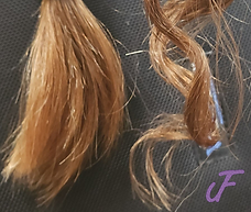
I chose this photo for "Conceptual Contrast 4" because I had just done my curly hair routine the night before, and I wanted to show off how nicely my curls had stayed. This picture shows conceptual contrast because Ozlem's straight hair is positioned next to my curly hair, showing complete opposites.
I chose this photo for "Texture Contrast 1" because the image shows a close up of a microphone, and singing is one of my biggest passions. This picture shows conceptual contrast because the raised texture on the top of the microphone is the complete opposite of the flat and smooth handle.

I chose this photo for "Texture Contrast 2" because the image shows a close up of a styrophone manican wearing a spikey wig. This picture shows conceptual contrast because the "pores" on the manican feel totally different to the touch then the fake hair does.
I chose this photo for "Texture Contrast 3" because I really enjoy drawing, and this image focuses on paper- my canvas for art. This picture shows texture contrast because the regular sheet of computer paper is smooth and flat, whereas the crumpled-up paper will never be able to get rid of its crinkles. The flat sheet is soft, whereas the crushed sheet has more of a rough texture to it.

I chose this photo for "Texture Contrast 4" because I enjoy being outside in nature, and this image shows something you could find in it- a pinecone! This picture shows texture contrast because the pinecone is spiky and scaly, whereas the table it is sitting on is smooth and flat.

For this project, called "Big Perspective 1," I used a photo that I took in Florida of lit-up palm trees. This picture shows perspective as the trees and sidewalk converge in the middle, creating a sense of depth in the flat photograph.

For this project, called "Big Perspective 2," I used a photo that I took walking up my street during a thunderstorm. This picture shows perspective as the road and trees converge in the middle, creating a sense of depth in the flat photograph.

For this project, called "Big Perspective 3," I took photo of a drawing that I made in art class last year. This drawing shows perspective as the road converges in the middle, creating a sense of depth in the flat work.
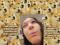
For this project, called "Small Perspective 1," I took a photo of Bella using the 0.5 camera setting on my phone. This picture shows perspective as Bella's head appears to get wider in the distance, and her chin comes to a point as she looks up.

For this project, called "Small Perspective 2," my best friend took a photo of me making a silly face using the 0.5 camera setting on her phone. This picture shows perspective as my head appears to get wider in the distance, and my chin comes to a point as I look down.

For this project, called "Small Perspective 3," I set a 10 second timer, flipped the camera, and placed my phone on the ground of NYC. I did this so that the skyscrapers would appear even taller than they already were, and I had my mom and I hug each other right in front of them. This picture shows perspective as the buildings come to a point in the distance, as well as our heads.

For this project, called "Depth of Field 1," I began by photographing Bella's Starbucks drink in focus, and a carbonated beverage behind it out of focus. These two objects relate to each other because they are both fun drinks that I like. After adding this image to photoshop, I chose a coffee shop as the background because both drinks can be bought from there.

For this project, called "Depth of Field 2," I began by photographing a pair of headphones in focus, and a microphone behind it out of focus. These two objects relate to each other because they can both be used for music purposes. After adding this image to photoshop, I chose a studio as the background because music is recorded in a studio.

For this project, called "Depth of Field 2," I began by photographing a computer mouse in focus, and a computer behind it out of focus. These two objects relate to each other because they are both used for technology. After adding this image to photoshop, I chose a Wi-Fi symbol as the background because technology relies on the internet.

For this project, called "Depth of Field 4," I used a photo of a ball close to the camera in focus, as well a woman behind it playing out of focus. These two things relate to each other because a game needs a person in order to be played. After adding this image to photoshop, I chose a pool as the background because it has the same name as the game "pool."

For this project, called "Forced Perspective 1," I used a picture of me last summer "holding" the sun. I achieved this look by standing close to the camera during sunset and having my mom give me directions on how far up/down/left/right I should raise my hand. This shows forced perspective because I used an optical illusion to make the sun appear much closer to me than it really was. Finally, I added a sunset as the backround to relate to my photo.

For this project, called "Forced Perspective 2," I used a picture of a statue "resting" its head on Mr. Grillo's shoulder. I achieved this look by placing the statue close to the camera and having Mr. Grillo stand farther back, telling him how to angle his hand. This shows forced perspective because I used an optical illusion to make the statue appear much bigger than it really was.
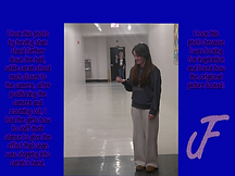
For this project, called "Forced Perspective 3," I took a picture of Shan "standing" in Carah's hand. I achieved this look by asking Carah to stand close to the camera, and Shan much farther back. Then, I told Carah how to position her hand to make it look like Shan was standing in it. This shows forced perspective because I used an optical illusion to make it look like Carah's palm was lifting an entire person.

For this project, called "Full Phone Reflection 2," I placed Mr. Grillo's dinosaur squishy in front of my phone. Then, I angled my phone slightly so that it created a reflection of the dinosaur, making it seem as though it was looking at himself in a mirror.

For this project, called "Full Phone Reflection 3," I placed my needoh squishy in front of my phone. Then, I angled my phone slightly so that it created a reflection of the needoh, allowing my phone to act as a mirror.